What is Contrast?
Contrast is the difference between perceived luminance or brightness between colors. Basically, this relates to your eye’s ability to tell the difference between 2 or more colors. It’s important to have adequate contrast between foreground and background colors. Good contrast reduces eye strain for all users and improves communication.
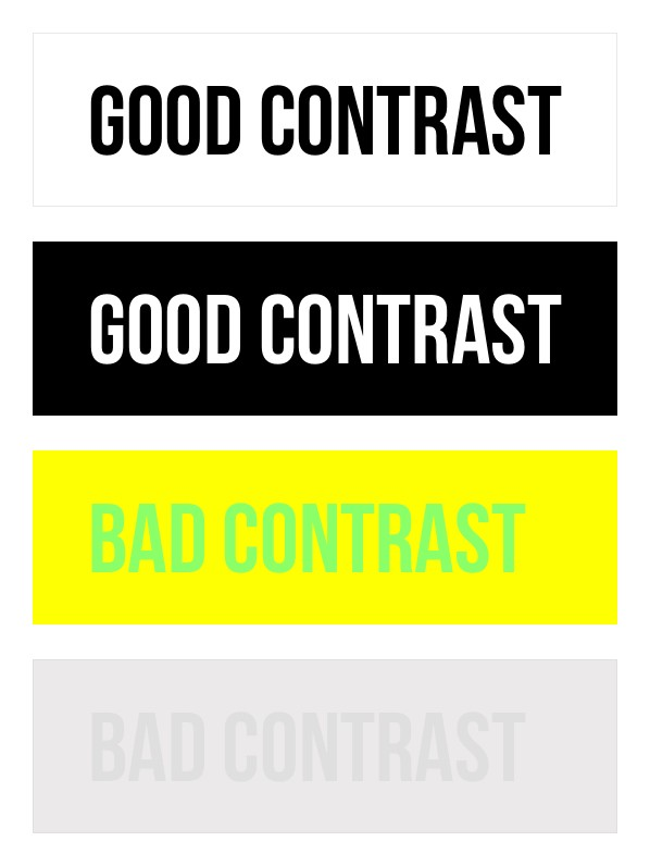
Image caption: The above image provides an example of Good Contrast and Bad Contrast. Lines 1 & 2: Good contrast written in black text with white background and white text with a black background. Lines 3 & 4 demonstrate bad contrast written in lime green text with yellow background and grey text with a light grey background.
Who is impacted by bad contrast?
- Users of adaptive technologies like screen magnifiers
- People with colorblindness
- Graphic designers and artists
- People in temporary situations- they may be standing in bright sunlight or using an older monitor.
Tips for improving contrast
- When using color to denote something in text use another visual indicator to differentiate the text, such as boldface or text size. Don’t rely entirely on color as a way to indicate something!
- It’s a good idea to zoom in when presenting documents or websites on screen so that everyone can comfortably view the material.
- If you’re unsure about the contrast of an image, use a color contrast checker tool!
Free tools!
In some cases checking contrast can be very challenging. There are many free digital tools that take the guesswork out of contrast checks.