What is contrast?
Contrast is the difference between perceived luminance or brightness between colors. Basically this relates to your eye’s ability to tell the difference between 2 or more colors. It’s important to have adequate contrast between foreground and background colors. Good contrast reduces eye strain for all users and improves communication. WCAG Guidelines for accessible text recommend a contrast ratio of 4.5:1 for body text and 3:1 for large-scale text.
For example, the image below shows four examples of accessible and non-accessible color choices.
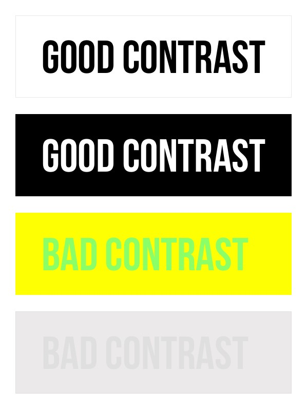
Image caption: The above image provides an example of Good Contrast and Bad Contrast. Lines 1 & 2: Good contrast written in black text with white background and white text with black background. Lines 3 & 4 demonstrate bad contrast written in lime green text with yellow background and grey text with light grey background.
Using Color for Emphasis
Don’t rely entirely on color as a sole way to highlight something important. When using color to emphasize text, use another visual indicator to differentiate it such as boldface, patterns/shapes highlighting, or increasing text size. Do not use italics which makes it challenging to read or underline text which can be confused with embedded links.
Color and Contrast Tools
If you’re unsure about the contrast of an image, use a color contrast checker tool. There are many free digital tools that take the guesswork out of contrast checks